Here at Finley Wealth Management, we try to keep the financial jargon to a minimum. But even where we may succeed, you’re likely to encounter references elsewhere that can turn valuable information into mumbo-jumbo yet to be translated. Consider us your interpreter. Today, we’ll explore correlation, and why it matters to investing.
A Quick Take: Correlation Helps People Invest More Efficiently
Expressed as a number between –1.0 and +1.0, correlation quantifies whether, and by how much two holdings have behaved differently or alike in various markets. If we can identify holdings with weak or no expected correlation among one another, we can combine these diverse “pieces” (individual investments) into a greater “whole” (an investment portfolio), to help investors better weather the market’s many moods.
Correlation, Defined
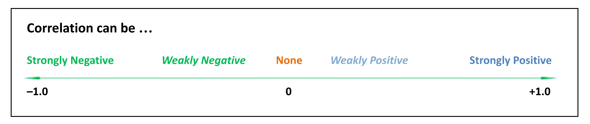
As suggested above, correlation is more than just a quality; it’s also a quantity – a measurement – offering two important insights along a spectrum of possibilities between –1.0 and +1.0:
Correlation can be positive or negative, which tells us whether two correlated subjects are behaving similarly to or opposite of one another.
Correlation can be strong or weak (or high/low), which tells us how powerful the similar or opposite behavior has been.
Correlation, Applied
If you’ve been around the investment block, you’ve probably heard about the benefits of diversification, or owning many, as well as many different kinds of holdings. A well-diversified portfolio helps you invest more efficiently and effectively over time. Diversification also offers a smoother ride, which helps you better stay on course toward your personal financial goals. But in a world of nearly infinite possibilities, how do we:
Compare existing funds – If one fund is expected to perform a certain way according to its averages, and another fund is supposed to perform differently according to its own averages, how do you know if they’re really performing differently as expected?
Compare new factors – What about when a researcher claims they’ve found a new factor or source of expected returns? As this University of Chicago paper explains, “factors are being discovered almost as quickly as they can be packaged and sold to the waiting public.” How do we determine which are actually worth considering out of the hundreds proposed?
Compare one portfolio to another – Even perfectly good factors don’t always fit well together. You want factors that are not only strong on their own, but that is expected to create the strongest possible total portfolio once they’re combined.
Correlation is the answer to these and other portfolio analysis challenges. By quantifying and comparing the behaviors and relationships found among various funds, factors, and portfolios, we can better determine which combinations are expected to produce optimal outcomes over time.
Correlation, Calculated
Fortunately, as an investor, you don’t necessarily need to know how to precisely calculate correlations. But it’s useful to know what correlation measurements mean when you see them.
Strong (high), positive correlation tells us that two investments seem to be playing a highly similar role; when that’s the case, you may not need to hold both of them.
Strong (high), negative correlation offers the most diversification, but it’s hard to find. Prone as they are to herd mentality, most holdings follow general trends at least a little.
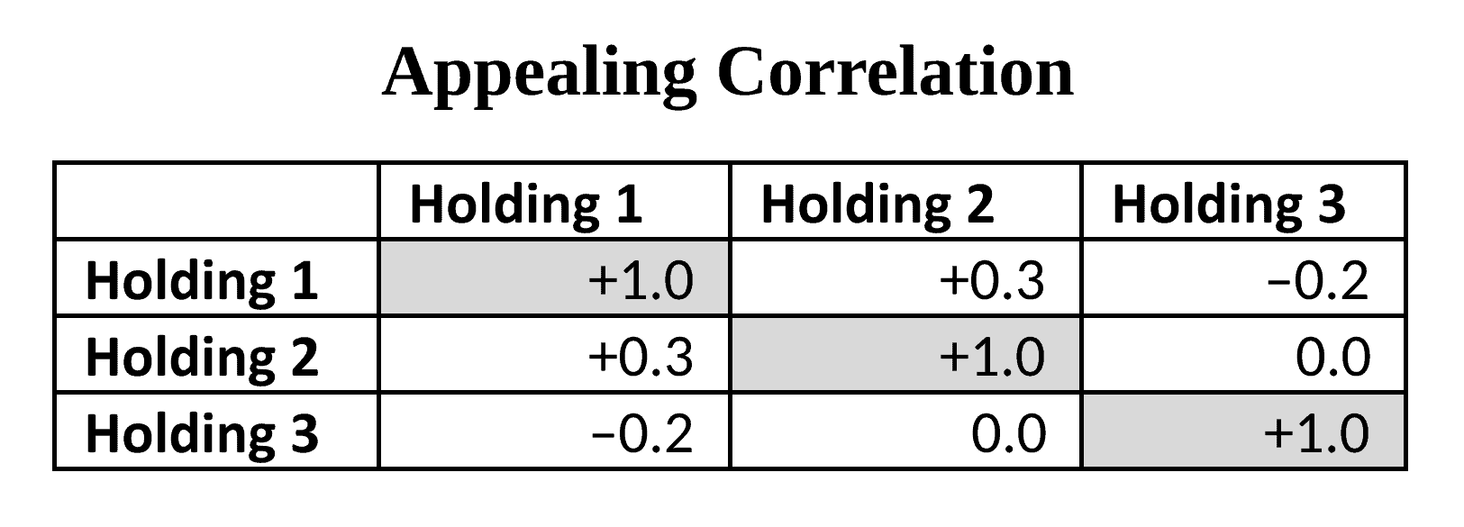
Weak (low) or no (zero) correlation is thus the preferred relationship we typically seek between and among the funds we use to build a diversified portfolio.
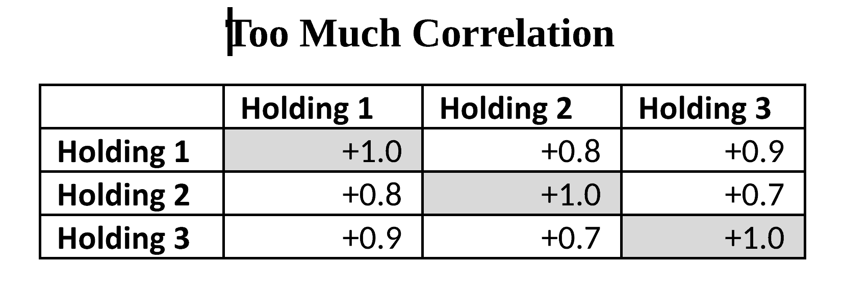
Here’s a simplified example of an appealing correlation among three holdings. Each holding exhibits a satisfying level of weak or no correlation with the other two. (A holding will always have a perfect positive correlation with itself, thus the +1.0 measurements.)What if your correlations look more like the trio below? Because all correlations here are strongly positive, you might reconsider whether these holdings are sufficiently diversified to make the most of varied market conditions and sources of expected returns. Correlation, Clarified
It’s worth adding a couple more clarifying points before we wrap.
Comparing Investments – First, the correlation between two holdings is not calculated by directly comparing the returns of each holding. Instead, we compare how each holding’s returns move up and down relative to its own average returns. In “Reducing the Risk of Black Swans,” co-authors Larry Swedroe and Kevin Grogan illustrate how this works: “A positive correlation exists between two assets when one asset produces above-average returns (relative to its average) and the other asset tends to also produce above-average returns (relative to its average). The stronger the tendency, the closer the correlation will be to +1.” In other words, two investments may seem quite different at a glance. But if you compare them to their own usual performance, and they both tend to sink or soar in reaction to the same market conditions, they are unlikely to offer strong diversification benefits if you pair them together.
Going the Distance – Also, correlation is not a “set it and forget it” number. For example, two funds may usually exhibit a weak correlation, but this can shift if a bear or bull market roars in and wreaks havoc on business as usual. In short, the solid analysis calls for studying correlation data across multiple markets and over time, to better understand what to expect during various market conditions. This is another reason to take care when adding new factors to your portfolio. Even if a new opportunity seems promising, you may want to wait and see how it performs over time and around the globe before you buy into the latest popular find.
Correlation, Concluded Heeding correlation data is a lot like having a full line-up on your favorite sports team. If each player on the roster adds a distinct, useful, and well-played talent to the mix, odds are, your team will go far. Similarly, your investment portfolio is best built from a global “team” of distinct factors, or sources of returns. A winning approach combines quality components that exhibit weak or no correlation among or between them across varied, long-term market conditions.
Let us know if we can help you use correlation to enhance your own investment experience.
Douglas Finley, MS, CFP, AEP, CDFA founded Finley Wealth Advisors in February of 2006, as a Fiduciary Fee-Only Registered Investment Advisor, with the goal of creating a firm that eliminated the conflicts of interest inherent in the financial planner – advisor/client relationship. The firm specializes in wealth management for the middle-class millionaire.